Flat Logo Design: When Simple is Better
The Composition of a Flat Logo Design
Flat logo design may be here to stay, or it may simply be a passing trend waiting to be eclipsed by what comes next year. Either way, the popularity of flat design has increased among professional designers influencing website design, graphic design, and logo design. The flat design trend can be seen across nearly every aspect of visual design. The characteristics of flat logo design are remarkable and quite unique.
 Flat design is not a revolutionary design shift. It became more popular after Windows Phone was introduced in late 2010 and again with Windows 8. The icon design and logo design used in Microsoft’s new products went away from the glare effects, and photo realistic graphics.
So what are the elements that come together to create flat design? Above is the logo blueunderground created for IM Autohaus.
It’s the lack of elements. It’s the simple, crisp two-dimensional format that does not utilize shadows, complex gradients, bevels, feathered effects and three-dimensional appearance. Flat logo design uses beautiful color combinations, considers the use of cohesive color combinations and a balanced use of negative space. The reduced complexity focuses the eye on the typography and the shape.
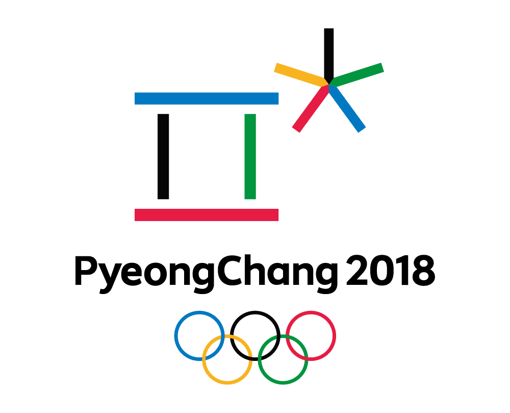
 The logo for the 2018 Winter Olympic Games in PyeongChang carries these principals of Flat Logo Design forward, emphasizing simplicity, basic geometric shapes and flat, unmodulated, colors. The PyeongChang Organizing Committee said, “The first character in the emblem also represents a gathering place where the three elements of Cheon-ji-in – heaven, earth, and human – are in harmony. The second character symbolises snow and ice, as well as the athletes’ stellar performances.“
Read more about logo design and see blueunderground’s portfolio of logo designs.

