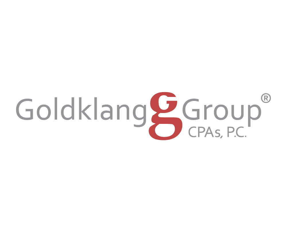

Goldklang Group, CPAs, P.C.
Our Task
Accounting Firm Logo Design Task
Goldklang Group CPAs, P.C. needed a new brand identity for an accounting firm serving a specialized professional market. The project included logo design, marketing materials, website design and development, stationery, and promotional items. The Accounting Firm Logo Design assignment focused on creating a visual foundation that could support a professional services firm with a strong niche, a long client-service history, and a clear need for consistent public presentation.
blueunderground created the logo and supporting brand materials for Goldklang Group CPAs. The work needed to communicate professionalism, trust, financial clarity, and the firm’s focus on Common Interest Realty Associations. An accounting firm serving homeowners associations, condominiums, and cooperatives has to appear precise and dependable. The Accounting Firm Logo Design needed to help the firm look established, organized, and credible before a prospective client reviewed a service page or requested a proposal.
The project was part of a larger identity system. The logo needed to work with business cards, letterhead, envelopes, notecards, website design, promotional items, and other client-facing materials. That broader system made the logo especially important. The Accounting Firm Logo Design had to function as the anchor for the firm’s name, visual style, and professional tone across print and digital touchpoints.
Goldklang Group’s work is not generic accounting. The firm specializes in audit, tax, budget, and consulting services for Common Interest Realty Associations. That focus gave the brand project a specific audience: property managers, board members, association leaders, condominium communities, cooperatives, and homeowners associations. The Accounting Firm Logo Design needed to feel appropriate for that audience without becoming overly decorative or too conservative to be remembered.
For blueunderground, the assignment centered on brand interpretation, logo design, professional services design, and coordinated marketing support. The goal was to create a mark and identity direction that could help Goldklang Group present its expertise with greater consistency. The finished Accounting Firm Logo Design helped give the firm a stronger visual presence for its website, stationery, marketing materials, and ongoing client communication.
Services Provided
Accounting Firm Logo Design Services Provided
blueunderground provided logo design and brand identity services for Goldklang Group CPAs, P.C. The Accounting Firm Logo Design work focused on visual identity, professional services branding, print collateral, website integration, and brand consistency for a specialized accounting firm.
- Custom accounting firm logo design
- Professional services brand identity design
- Logo concept development and refinement
- Business card, letterhead, envelope, and notecard design
- Website design and website development support
- Promotional item design
- Visual asset preparation for print and digital use
- Brand presentation for an accounting and CPA firm
- Identity support for audit, tax, budget, and consulting services
- Coordinated brand system for Goldklang Group CPAs
The project drew on blueunderground’s Logo Design, Print Design, and Website Design & Website Development experience. Goldklang Group needed a brand that could work across many business materials, not only a single website header. The Accounting Firm Logo Design therefore needed to remain clear and useful in multiple formats.
The service mix was built around a complete brand presentation. A professional services firm is often judged through many small impressions: a business card, a proposal, a letter, a website, an office sign, a referral, or a follow-up email. The Accounting Firm Logo Design needed to give those materials a consistent visual starting point.
Because Goldklang Group serves a specialized accounting market, the logo could not rely on generic corporate styling alone. The identity needed to support a firm with knowledge of community association accounting, audit work, tax preparation, budget issues, and consulting needs. The Accounting Firm Logo Design had to feel professional enough for financial services while still giving the firm a distinct visual presence.
The logo also needed to work alongside the related Accounting Firm Website Design project. The website extended the identity into navigation, service presentation, page layout, and digital marketing. The logo gave that larger website and brand system a recognizable foundation.
blueunderground also supported the print and marketing pieces that carried the brand into daily business use. Stationery, envelopes, notecards, business cards, and promotional items may seem small individually, but together they create a repeated impression. The Accounting Firm Logo Design helped those materials feel connected and intentional.
Accounting Firm Logo Design for a Professional Services Brand
A professional services logo has to earn trust quickly. Prospective clients may not know the details of a firm’s experience when they first see its identity. They respond to whether the brand looks stable, organized, thoughtful, and credible. The Accounting Firm Logo Design for Goldklang Group needed to support that first impression.
Accounting firms work in fields where accuracy and judgment matter. Audit, tax, budget, and consulting services depend on confidence. Clients want to know that the firm understands their financial concerns and can provide careful guidance. A logo alone cannot communicate all of that detail, but it can help create the right frame for the conversation.
For Goldklang Group, that meant avoiding a look that felt casual or temporary. The identity needed to suggest a firm with a defined specialty and an established professional role. The Accounting Firm Logo Design gave the firm a visual foundation that could support serious client conversations and practical marketing needs.
Professional services branding also has to be flexible. The same identity may appear on a website, letterhead, email attachment, proposal, business card, office sign, promotional item, or printed handout. A successful Accounting Firm Logo Design has to stay recognizable across those uses while preserving legibility and tone.
The project also needed to balance distinction with restraint. Accounting firms should not look bland, but they also should not look gimmicky. Goldklang Group’s identity needed to be memorable enough to support recognition while remaining appropriate for a firm that works with financial statements, boards of directors, property managers, and association leaders.
Accounting Firm Logo Design for Community Association Clients
Goldklang Group’s specialization gave the project a clear strategic context. The firm serves Common Interest Realty Associations, including homeowners associations, condominiums, and cooperatives. Those clients often work with accountants on audits, tax returns, budgets, board reporting, financial statements, and consulting questions tied to association operations. The Accounting Firm Logo Design needed to support a brand that understood those specialized needs.
A firm serving community associations does not communicate with only one type of decision-maker. A property manager may recommend the firm. A board treasurer may review financial materials. A board president may compare providers. A general manager may need guidance on audits, tax filings, or budget questions. The identity needed to feel credible across all of those audiences.
That audience also makes consistency important. Association clients may encounter the firm through a referral, a proposal, a letter, a website, a meeting, or a printed piece. When those materials share a clear brand identity, the firm appears more prepared and easier to recognize. The Accounting Firm Logo Design helped Goldklang Group create that consistency.
The logo also needed to support the firm’s relationship-centered service model. Goldklang Group emphasizes personalized, hands-on work with property management representatives and boards of directors. A visual identity for that kind of firm should not feel remote or impersonal. It should support a professional tone while making the firm feel accessible.
For blueunderground, the challenge was to create a logo that could represent both technical competence and client-focused service. The Accounting Firm Logo Design needed to connect Goldklang Group’s specialized accounting role with a broader sense of professional trust.
Accounting Firm Logo Design With Brand Consistency
Brand consistency was central to the Goldklang Group project. The logo was not intended to stand alone. It was part of a larger brand system that included website design, stationery, marketing materials, and promotional items. The Accounting Firm Logo Design needed to establish a visual language that could carry through those pieces.
A consistent identity helps professional firms look more established. When a website uses one style, a business card uses another, and a letterhead uses something else, the organization can appear fragmented. For Goldklang Group, blueunderground helped bring the materials into a more unified system.
The logo gave the brand a repeatable visual anchor. That anchor could be used on business cards, letterhead, envelopes, notecards, promotional materials, and the website. The Accounting Firm Logo Design helped make those applications feel connected rather than separate one-off pieces.
Consistency is especially useful for a firm that depends on long-term relationships. Goldklang Group works with association clients over time, and many client interactions happen through correspondence, reports, proposals, meetings, and routine communication. A recognizable visual identity helps reinforce the firm’s presence through those repeated touchpoints.
The identity also helped support the related website project. A website is often the most visible expression of a brand, but it should not feel disconnected from printed materials. The Accounting Firm Logo Design gave the website a visual foundation that could be extended into layout, color, typography, and service presentation.
Accounting Firm Logo Design for Website and Print Materials
The Goldklang Group project included both digital and print needs. The logo had to work on screen, in print, and across business materials used by the firm. The Accounting Firm Logo Design needed to remain clear whether someone saw it on a website, a business card, a letterhead sheet, an envelope, or a promotional item.
Digital use requires clarity at different sizes. A logo may appear in a website header, on a mobile screen, in a browser tab, in email communication, or in a digital document. It has to remain legible and recognizable without depending on excessive detail. The Accounting Firm Logo Design needed to support those practical conditions.
Print use brings a different set of requirements. Business stationery, notecards, envelopes, and marketing pieces need artwork that reproduces cleanly and holds up in formal business communication. For an accounting firm, printed materials should feel tidy, professional, and dependable. The logo needed to help establish that tone.
Promotional items add another layer. A mark may need to work on different materials, surfaces, colors, and proportions. A logo that is too complicated can become difficult to reproduce. The Accounting Firm Logo Design therefore needed a level of simplicity that made broader brand application possible.
The project also connected to website design and development. As the visual identity moved into the website, the logo helped set the tone for the firm’s digital presence. The site could then support the same professional identity through navigation, page structure, service language, and visual consistency.
Accounting Firm Logo Design for Trust and Recognition
Trust and recognition were important practical goals for the Goldklang Group identity. An accounting firm may be introduced through a referral, a management company, a board meeting, a proposal packet, a printed letter, or an online search. In each of those settings, the brand needs to feel consistent and easy to identify. The Accounting Firm Logo Design helped give Goldklang Group a visual signature that could support those moments.
Recognition matters because professional services decisions are often made over time. A property manager may see the firm’s materials before recommending it to a board. A board member may review the website after receiving a proposal. A current client may share a printed document or contact information with another association. The Accounting Firm Logo Design needed to help the firm remain recognizable across those different touchpoints.
Trust also depends on tone. A logo for an accounting firm should not feel impulsive or overdesigned. It should feel deliberate, clear, and appropriate for a business that works with financial records and board-level decisions. Goldklang Group’s identity needed to communicate stability without becoming forgettable.
The mark also had to support the firm’s service story. Goldklang Group’s work combines audit, tax, budget, consulting, and specialized association accounting knowledge. The Accounting Firm Logo Design gave that professional story a visual starting point, helping the firm present itself as a focused accounting partner rather than a generic service provider.
That balance between recognition, restraint, and professionalism made the logo useful beyond its immediate appearance. The Accounting Firm Logo Design helped create a brand foundation that could be repeated, remembered, and trusted across the firm’s website, stationery, marketing materials, and client-facing communications.
Accounting Firm Logo Design Results
The completed project gave Goldklang Group CPAs, P.C. a stronger visual identity for its accounting firm brand. The Accounting Firm Logo Design helped the firm present itself with greater consistency across logo, website, stationery, marketing materials, and promotional items.
The logo supported a firm with a defined professional specialty. Goldklang Group’s work with homeowners associations, condominiums, cooperatives, and Common Interest Realty Associations required a brand that felt credible and focused. The Accounting Firm Logo Design helped give that specialization a clearer public-facing identity.
The project also connected visual identity to practical business communication. Business cards, letterhead, envelopes, notecards, and promotional items gave the firm repeated opportunities to reinforce the brand. The logo helped those materials feel related and professional.
The related website project extended the identity into a digital format. Together, the logo and website helped Goldklang Group present its services, client focus, and professional credibility in a more complete way. The Accounting Firm Logo Design became the foundation for that larger brand system.
For blueunderground, the project is a strong example of logo design for a specialized professional services firm. The Accounting Firm Logo Design connected brand identity, print design, website support, and business communication in service of an accounting firm with a focused audience and a long-term client relationship model.
About Goldklang Group CPAs, P.C.
About Goldklang Group CPAs, P.C.
Goldklang Group CPAs, P.C. is an accounting firm located in Reston, Virginia. The firm provides accounting, auditing, tax, budget, and consulting services for Common Interest Realty Associations, including homeowners associations, condominiums, and cooperatives. That specialized professional context shaped the Accounting Firm Logo Design from the beginning.
Goldklang Group describes itself as the area’s leading CPA firm specializing in audit, tax, budget, and consulting services for Common Interest Realty Associations. Its Who We Are page describes more than 40 years of experience and a strong understanding of the accounting needs and operations of community associations. The Accounting Firm Logo Design needed to support that established, specialized positioning.
The firm’s public materials emphasize superior knowledge of accounting and tax issues facing community associations, as well as personalized, hands-on service for property management representatives and boards of directors. That combination of expertise and service gave the brand project a practical focus. The identity needed to feel professional, but it also needed to support relationship-driven communication.
Goldklang Group’s service areas include auditing, tax preparation, and consulting. Those services reinforced the need for a logo that could support serious financial work while remaining approachable for association boards and managers.
The firm’s auditing work includes association financial statements and related reporting concerns. Its tax work includes attention to issues that affect condominiums, homeowners associations, and cooperatives. Its consulting services include areas such as budget development, accounting procedures, investment procedures, and bank loan analysis. The Accounting Firm Logo Design needed to sit comfortably within that professional service environment.
Goldklang Group also publishes resources and guidance for its audience. Its publications section and article on choosing the right bank point to the firm’s broader role in helping association clients understand financial decisions. That public education context reinforced the need for a stable, recognizable brand.
The firm’s client testimonials emphasize professionalism, responsiveness, audit and tax guidance, timely service, and long-term relationships with community association clients. Those themes aligned with the design goals for the project. The Accounting Firm Logo Design needed to help present a firm that clients could view as knowledgeable, steady, and service-oriented.
Goldklang Group also notes that its work has been independently peer reviewed through the American Institute of Certified Public Accountants Private Companies Practice Section since 1991, receiving the highest available rating of pass. That credential reinforced the need for a logo and brand system that felt disciplined and credible.
For blueunderground, the Goldklang Group logo project demonstrates how brand identity can support a specialized accounting firm beyond the logo itself. The Accounting Firm Logo Design helped create a professional foundation for the firm’s website, stationery, marketing materials, promotional items, and client-facing communication. The result was a more unified identity for a firm with a clear specialty, a defined audience, and a long-standing reputation in community association accounting.


![blueunderground [ web + design ]](https://blueunderground.com/wp-content/uploads/2023/12/blueunderground-logo-2023-footer.svg)

